
Liz Blake

With over 8 years of experience in brand identity design and illustration, Lize crafts thoughtful, expressive identities for considered brands. For Lize, design is both a strategic tool and a creative language — one that invites clarity, confidence and genuine connection.

THE DESIGNER:

Liz is passionate about creating work that feels aligned, human and purposeful, helping brands articulate who they are and connect meaningfully with the people they’re here to serve.

experience:

8+ years

SKILLS:

Brand Strategy & Identity, Website Design, Print Design, Packaging Design, Illustration

Liz Blake

Portrait of designer Liz Blake with pink-tipped hair smiles warmly in an orange and pink patterned sweater, framed by green plants and wooden shelving.

With over 8 years of experience in brand identity design and illustration, Lize crafts thoughtful, expressive identities for considered brands. For Lize, design is both a strategic tool and a creative language — one that invites clarity, confidence and genuine connection.

Selected Projects

Where strategy meets creative language

Service: Creative Direction, Packaging Design, Illustration / Client: Ficifolia Fragrances

Service: Creative Direction, Packaging Design, Illustration / Client: Ficifolia Fragrances

Ficifolia Fragrances

Ficifolia Fragrances

  • Ficifolia 'Out of Office' perfume bottle styled with jeweled citrus fruits and crystal decor in warm light.
  • Black-and-white Melbourne skyline illustration with a red figure silhouette, part of the Ficifolia packaging design.
  • Split image of the Ficifolia 'Rose Street' perfume bottle beside a hand holding the labeled scent bottle.
  • Set of red line illustrations including a cocktail, dog, camera and rose, displayed on a burgundy velvet backdrop.
  • Row of Ficifolia fragrance boxes featuring cityscape illustrations and a red figure motif, including 'Intermission'.

Ficifolia Fragrances created a range of scents referencing different moments in their founding city of Melbourne. The iconic bottle shape is used in playful ways across the packaging, while the illustrations nod to the experiences each scent evokes.

Ficifolia Fragrances created a range of scents referencing different moments in their founding city of Melbourne. The iconic bottle shape is used in playful ways across the packaging, while the illustrations nod to the experiences each scent evokes.

Service: Brand Identity, Physical Rollout / Client: Bud of Love

Service: Brand Identity, Physical Rollout / Client: Bud of Love

Bud of Love Winestore

Bud of Love Winestore

  • Bud of Love scalloped coaster with its wine-bottle logo rests on dark marble beside olives and charcuterie.
  • Instagram post on a smartphone showing a Renaissance-style painting with a playful 'Wine eyes' sticker overlay.
  • Round black shop sign featuring a wine glass icon, mounted outside the Bud of Love winestore entrance.
  • Bud of Love branded shipping box open to reveal a wine bottle with a playful 'Cheers' note card inside.
  • Split image of a hand holding a wine glass beside bar stools, set in a moody dark marble interior.
  • Overhead shot of red wine being poured onto a scalloped Bud of Love coaster on a dark marble table.
  • Grid of black line icons including a heart, playing cards, wine glass and rose, on a lavender background.

The Bud of Love identity was developed with strong typographical and illustrative elements, paying homage to the origins of the brand. The ‘bud break’ is a part of the wine making process and is referenced in the imagery throughout. Overall the brand is bold, playful and impactful.

The Bud of Love identity was developed with strong typographical and illustrative elements, paying homage to the origins of the brand. The ‘bud break’ is a part of the wine making process and is referenced in the imagery throughout. Overall the brand is bold, playful and impactful.

Service: Brand Identity / Client: Ariise

Service: Brand Identity / Client: Ariise

Ariise

Ariise

  • Ariise brand posters in olive, terracotta and dark tones mounted on a brick wall, blending lifestyle photography and typography.
  • Close-up of the Ariise wordmark in white serif type overlaid on a red-lit textured surface against black.
  • Smartphone lying on concrete displays the Ariise Instagram grid with colorful lifestyle and mood imagery.
  • Dark green poster reading 'The Cocreation of (You)' with a soft red gradient orb above the Ariise logo.
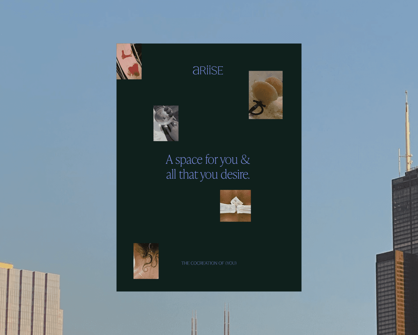
  • Ariise moodboard poster combining collaged photos and the tagline 'A space for you & all that you desire' against a city skyline.
  • Close-up of a terracotta matchbox labeled Ariise, opened to reveal matches in warm sunlight on concrete.

The ariise brand identity balances aspiration with accessibility through careful curation of vision-board-esque lifestyle imagery, the ariise aura (gradient) and a strong, yet grounded colour palette. The brand shares neuroscience backed practices and tools with their community, to help them manifest their dream life.

The ariise brand identity balances aspiration with accessibility through careful curation of vision-board-esque lifestyle imagery, the ariise aura (gradient) and a strong, yet grounded colour palette. The brand shares neuroscience backed practices and tools with their community, to help them manifest their dream life.

Service: Brand Identity, Packaging Design / Client: Quinn

Service: Brand Identity, Packaging Design / Client: Quinn

Quinn

Quinn

  • Quinn safety razor packaging in warm orange stands upright against a light tiled background.
  • Close-up of a Quinn safety razor resting on skin, overlaid with the tagline 'the good alternative.
  • Exploded diagram labeling the Quinn safety razor's anatomy: cap, stainless steel blade, safety guard and weighted handle.
  • Gold-toned Quinn safety razor lies open in its orange packaging box on a light surface.
  • Two people embrace arm in arm, overlaid with the Quinn tagline 'for you and for the planet.'
  • Two Quinn instructional illustrations showing how to use the razor and change its blades, on a orange background.

The Quinn identity was developed around the brand’s philosophy: an easy (and damn good) alternative to disposable razors that celebrates their customers, just the way they are. The identity is simple, clear and bold, allowing the product to speak for itself using product imagery focused around Quinn’s diverse community.

The Quinn identity was developed around the brand’s philosophy: an easy (and damn good) alternative to disposable razors that celebrates their customers, just the way they are. The identity is simple, clear and bold, allowing the product to speak for itself using product imagery focused around Quinn’s diverse community.

Service: Brand Identity, Website Design / Client: Rhythm Health

Service: Brand Identity, Website Design / Client: Rhythm Health

Rhythm Health

Rhythm Health

  • Man in a tank top stands on coastal rocks by the ocean, overlaid with the Rhythm Health wordmark logo.
  • Rhythm Health website homepage shown on a laptop, featuring a hero image of a man stretching on a cliff.
  • Dark green textured background with the Rhythm Health wave-and-drop icon centered in cream white.
  • Split view of the Rhythm Health website's homepage and article page, both in dark green and cream tones.
  • Blurred portrait of a curly-haired man beside four line icons labeled Physical, Mental, Emotional and Spiritual.
  • Three Instagram story frames introducing the Rhythm Health 'What's Your Superpower?' quiz on a dark green background.
  • Man on a rocky shoreline looks out at the ocean, paired with the Rhythm Health logo and silhouette icon.

The Rhythm Health rebrand was designed to reflect founder Nick Perry’s personal evolution and how this evolution is also carried over through his coaching and offerings. A strong, masculine typographic logo is softened by the wave device, signifying the body’s innate rhythm.

The Rhythm Health rebrand was designed to reflect founder Nick Perry’s personal evolution and how this evolution is also carried over through his coaching and offerings. A strong, masculine typographic logo is softened by the wave device, signifying the body’s innate rhythm.

Service: Brand Identity, Website Design / Client: Burnt Sienna Flowers

Service: Brand Identity, Website Design / Client: Burnt Sienna Flowers

Burnt Sienna Flowers

Burnt Sienna Flowers

  • Close-up of soft peach dahlias with the hand-drawn Burnt Sienna Flowers vase logo overlaid at the center.
  • Burnt Sienna Flowers website homepage shown against a dark floral backdrop, with hand-lettered logotype and tagline.
  • Annotated close-up of the Burnt Sienna Flowers hand-drawn logotype, highlighting its organic, floral-inspired letterforms.
  • Two cream-colored care instruction cards for Burnt Sienna Flowers lying in soft natural light on a table.
  • Florist arranges white lilies and blooms, overlaid with three hand-drawn icons reading Honouring, Captivating, Authentic.

An enchanting yet warm identity was developed for Burnt Sienna Flowers. Hand drawn elements, paired with soft, textured imagery, nods to the sustainable practices Sofie uses in her heart-led floral designs and creative process.

An enchanting yet warm identity was developed for Burnt Sienna Flowers. Hand drawn elements, paired with soft, textured imagery, nods to the sustainable practices Sofie uses in her heart-led floral designs and creative process.